ShopDreamUp AI ArtDreamUp

Deviation Actions


Description
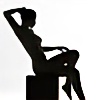
Picture made for the CG pinup "Black as noir" contest.
Maybe in my mind black+pinup= goth...")
except the door...every material shader has been carefully modified, So it took me very looong time to setup ( maybe around 10 hours for texturing and setting up the lighting), i really hope to get good feedback.
Thanks to everyone watching and thanks so much for those who leave some comments.
Maybe in my mind black+pinup= goth...
except the door...every material shader has been carefully modified, So it took me very looong time to setup ( maybe around 10 hours for texturing and setting up the lighting), i really hope to get good feedback.
Thanks to everyone watching and thanks so much for those who leave some comments.
Image size
3390x2310px 2.97 MB
© 2011 - 2024 CgGirls
Comments43
Join the community to add your comment. Already a deviant? Log In
Pretty good scene and render, however there are some things about this that seem a little not up to your usual standards. The pose is pretty nice, looking fairly natural for a girl sitting on the floor, with nothing really seeming like it defies the laws of nature.
Hair looks really nice and realistic. Some of the things that kind of let this one down are the eyes for starters. The eyes seem to have a dead stare rather than a natural look. They also seem a bit too flat, like maybe some more gloss over the eyes to present some reflections. I know the eyes are generally a really hard area for these types of renders, but I'm a firm believer that the eyes can make or break a render a lot of times. In this situation, they seem to have an unnatural reflection to them, like one that was already in the texture. As you can see the light source comes from the left of the image, however there is a reflection mark in the same spots on both eyes in the opposite direction of the light source.
The body skin seems ok for the most part, though I would have liked to see a more subtle hint of some skin shine with some displacement for skin details, possibly some subsurface scattering to really bring her to life. I know she's probably supposed to have more of a pale look, but I think some little extra skin detail wouldn't hurt though.
The tattoos are a good idea, though they do seem a tad too contrasted on the skin to look very realistic. I'm not sure if they were already apart of the skin texture, though if they weren't, and they were layered on in photoshop or something else, maybe having them faded with some skin appearing through the ink, and maybe even blur them would have looked a little more natural. Sometimes i understand it's not possible as the skin already comes with tats, but from my view, they seem more just stamped on rather than "part" of her. Hope that makes sense.
Lips also seem really dry, maybe some specularity with some displacement would have been a real nice touch. Aside from the girl , everything else looks prety good, and I can tell extra attention was paid to working the materials as you always seem to do in all your works.
I really hope this doesn't come across as being harsh and more helpful for future renders, as I know what level of quality you can produce from viewing your gallery and having you on my devwatch. Just somehow, I think this one feel short this time, unless you were aiming for less realism and more just an idea.
Good luck on the contest! <img src="e.deviantart.net/emoticons/w/w…" width="15" height="15" alt="